Saturday, December 1, 2012

To embed Youtube videos in Windows 8 xaml


I was making my 5th windows 8 application called National Geographic for Windows 8. The best part of the channel’s info lies in videos and all the major videos are uploaded on  YouTube. Though YouTube exposes all the videos through its feeds, its difficult to embed their video in xaml. Mainly because xaml does not support Flash. Now YouTube supports HTML 5 videos but I was not able to find many such videos. So I thought of going ahead with Flash players in xaml. The trick lied in embedding the player in an Iframe in a WebView.

This is the code snippet,
 str = string.Format(@"<iframe width='{0}' height='{1}' src='{2}' frameborder='{3}'></iframe>", videoView.ActualWidth - 10, videoView.ActualHeight - 10, link, 0);
videoView.NavigateToString(str);
where "link" is my YouTube video url and  "videoView" is my WebView control in the xaml like this

<Grid Style="{StaticResource LayoutRootStyle}">
<WebView x:Name="videoView" Grid.Row="2" Margin="120,0,10,90"/>
</Grid>

I just did a bit of styling and here is the output,

Monday, August 27, 2012

Things that I hate in Nokia Lumia 800..

Ever since I got Nokia Lumia 800 I have not stopped admiring it for its cut finishing and smooth touch response. But there are few things that I totally hate. No matter how hard I try I still cannot forget the facts that few things are so complex , rather just not there!
I am a person who loves to change the ringtone everytime a new song is released. But that was until I got Lumia. This phone does not allow the user to set their songs as ringtone. I cannot say that it does not allow completely as we can set the ringtone through Zune.
Steps to set ringtone in Lumia 800,
1.      Start your PC and plug your phone.
2.      Start Zune and search for you song.
3.      Change its genre to ringtone.
4.      Go back to your phones settings and search for your song.
5.      If you find it there then you are lucky and can set it as ringtone.
6.      If not then you have to “understand” that the song which you have selected must have been greater than 1 mb. Argh!!!
Steps to set ringtone in any other phone
1.      Search your favourite song and go to options
2.      Set as ringtone!!!
Oh I miss my old phone for this simplicity!! On top of it I thought of ending this problem and creating my own application that would simply set the ringtone without going to zune….To my surprise the classes are not exposed, the music file is not exposed!!!!! Why on earth did Microsoft do this!
Another thing that I really hate is not being able to use mobile tethering or sharing the internet connection with other devices. After a lot of searches on forums I found that it is not a windows phone 7 problem as its not available only in Nokia Lumia 800!!
These are few moments when I hate myself for buying this phone. I am otherwise a Microsoft fan and a pro Microsoft person but few things like these makes me crazy.

Saturday, March 10, 2012

Our first WP7 application-PicLabs is live!

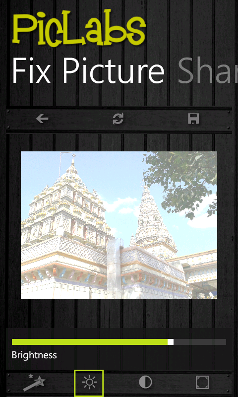
I was busy all these days creating a new application for Windows Phone 7..and I am so happy to announce that it is live! The app is called as PicLabs and is a photo editing tool. You can even post your edited photos on Facebook. Try it from here,
PicLabs on WP7 Market Place or check out the QR code

qrcode


Monday, January 30, 2012

Telerik Chart Legend in Metro Style

In my previous post you saw how to style the Telerik chart item in Metro Style. However you saw that the Legend was not at all matching the Metro Style. So let’s Style the ChartLegend.


Add a ChartLegend like this,
<telerikCharting:ChartLegend HorizontalAlignment="Left" VerticalAlignment="Top"/>
(Remember to delete this extra ChartLegend once you finish style as this is just to ease the creation of the style.)
Once added right click on the ChartLegend and select the Edit Template->Edit a copy option. Once the template for the ChartLegend opens up you will see the basic elements of style used in the slice. 
The border for the CharLegend has a gradient fill. Change it to a solid fill to match the metro UI.
Apply this Style to you chart Legend.

Code:
SeriesMapping pieSeries = new SeriesMapping();
pieSeries.SeriesDefinition = new PieSeriesDefinition();
pieChart.DefaultView.ChartLegend.LegendItemStyle = App.Current.Resources["ChartLegendItemStyle"] as Style;

On applying the style your Legend will partially get the Metro look.
I am saying partially because if you have noticed the Legend Item, it is still having a non-metro look.
Lets style this Legend Item as well. Follow the same procedure and open up the template for a ChartLegendItem. You will notice that the glossy look is because of the gradient fill in the PART_SelectedState path. Just remove this gradient fill or replace it with a solid fill.

Apply the ChartLegendItem style,

pieChart.DefaultView.ChartLegend.LegendItemStyle=App.Current.Resources["ChartLegendItemStyle"] as Style;

After all this our chart will be metro ready
Here is the complete code,
Code:
 <!--Legend Style-->
        <SolidColorBrush x:Key="LegendForeground" Color="#FF000000"/>
        <LinearGradientBrush x:Key="LegendBackground" EndPoint="1.96000003814697,0.5" StartPoint="-0.959999978542328,0.5">
            <GradientStop Color="#FFB5B5B5"/>
            <GradientStop Color="#FFF0F0F0" Offset="0.5"/>
        </LinearGradientBrush>
        <SolidColorBrush x:Key="LegendBorderBrush" Color="#FF848484"/>
        <Thickness x:Key="LegendBorderThickness">1</Thickness>
        <telerik:TextToVisibilityConverter x:Key="textToVisibilityConverter"/>
        <Style x:Key="ChartLegendStyle" TargetType="telerik:ChartLegend">
            <Setter Property="Foreground" Value="{StaticResource LegendForeground}"/>
            <Setter Property="Background" Value="{StaticResource LegendBackground}"/>
            <Setter Property="Padding" Value="10,10,10,5"/>
            <Setter Property="Margin" Value="0"/>
            <Setter Property="BorderBrush" Value="{StaticResource LegendBorderBrush}"/>
            <Setter Property="BorderThickness" Value="{StaticResource LegendBorderThickness}"/>

            <Setter Property="Template">
                <Setter.Value>
                    <ControlTemplate TargetType="telerik:ChartLegend">
                        <Border Background="#FF1B1B1B" BorderThickness="0">
                            <VisualStateManager.VisualStateGroups>
                             <VisualStateGroup x:Name="CommonStates">
                              <VisualState x:Name="Normal"/>
                              <VisualState x:Name="Disabled"/>
                             </VisualStateGroup>
                            </VisualStateManager.VisualStateGroups>
                            <Grid Margin="5">
                          <Grid.RowDefinitions>
                           <RowDefinition Height="Auto"/>
                           <RowDefinition Height="*"/>
                          </Grid.RowDefinitions>
                          <ContentControl ContentTemplate="{TemplateBinding HeaderTemplate}" Content="{TemplateBinding Header}" Foreground="White" FontFamily="Segoe UI" />
                          <ItemsPresenter Grid.Row="1"/>
                         </Grid>
                        </Border>
                    </ControlTemplate>
                </Setter.Value>
            </Setter>
            <Setter Property="ItemsPanel">
                <Setter.Value>
                    <ItemsPanelTemplate>
                        <telerik:RadWrapPanel Orientation="{Binding ItemsPanelOrientation}"/>
                    </ItemsPanelTemplate>
                </Setter.Value>
            </Setter>
            <Setter Property="HeaderTemplate">
                <Setter.Value>
                    <DataTemplate>
                        <Grid>
                            <TextBlock FontSize="12" HorizontalAlignment="Left" Height="Auto" Padding="0,0,0,2" TextWrapping="Wrap" Text="{Binding}"  Width="Auto"/>
                        </Grid>
                    </DataTemplate>
                </Setter.Value>
            </Setter>
        </Style>
     <LinearGradientBrush x:Key="LegendItemMarkerMask" EndPoint="0.5,1" StartPoint="0.5,0">
      <GradientStop Color="#D8FFFFFF" Offset="0.009"/>
      <GradientStop Color="#66FFFFFF" Offset="1"/>
      <GradientStop Color="Transparent" Offset="0.43"/>
      <GradientStop Color="#7FFFFFFF" Offset="0.42"/>
     </LinearGradientBrush>
        <!--End-->
        <!--Legend Item Style-->
        <SolidColorBrush x:Key="LegendItemMarkerMaskOpacityMask" Color="#FF000000"/>
     <SolidColorBrush x:Key="LegendItemMarkerMaskStroke" Color="White"/>
     <System:Double x:Key="LegendItemMarkerMaskStrokeThickness">1</System:Double>
     <SolidColorBrush x:Key="LegendItemMarkerMask2" Color="Transparent"/>
        <Style x:Key="ChartLegendItemStyle" TargetType="telerik:ChartLegendItem">
            <Setter Property="Foreground" Value="#FFFFFFFF"/>
            <Setter Property="Padding" Value="5,0,5,0"/>
            <Setter Property="Margin" Value="0,3,0,2"/>
            
            <Setter Property="Template">
                <Setter.Value>
                    <ControlTemplate TargetType="telerik:ChartLegendItem">
                        <Grid x:Name="PART_MainContainer" Background="{TemplateBinding Background}" HorizontalAlignment="Stretch" VerticalAlignment="Top">
                            <Grid.ColumnDefinitions>
                                <ColumnDefinition Width="Auto"/>
                                <ColumnDefinition/>
                            </Grid.ColumnDefinitions>
                            <VisualStateManager.VisualStateGroups>
                                <VisualStateGroup x:Name="HoverStates">
                                    <VisualState x:Name="Normal">
                                        <Storyboard>
                                            <DoubleAnimation Duration="0.00:00:00.15" To="1.0" Storyboard.TargetProperty="Opacity" Storyboard.TargetName="PART_MainContainer"/>
                                        </Storyboard>
                                    </VisualState>
                                    <VisualState x:Name="Hovered">
                                        <Storyboard>
                                            <DoubleAnimation Duration="0.00:00:00.15" To="1.0" Storyboard.TargetProperty="Opacity" Storyboard.TargetName="PART_MainContainer"/>
                                        </Storyboard>
                                    </VisualState>
                                    <VisualState x:Name="Hidden">
                                        <Storyboard>
                                            <DoubleAnimation Duration="0.00:00:00.15" To="0.15" Storyboard.TargetProperty="Opacity" Storyboard.TargetName="PART_MainContainer"/>
                                        </Storyboard>
                                    </VisualState>
                                </VisualStateGroup>
                                <VisualStateGroup x:Name="SelectionStates">
                                    <VisualState x:Name="Unselected"/>
                                    <VisualState x:Name="Selected">
                                        <Storyboard>
                                            <ObjectAnimationUsingKeyFrames Duration="0.00:00:00.05" Storyboard.TargetProperty="Stroke" Storyboard.TargetName="PART_LegendItemMarker">
                                                <DiscreteObjectKeyFrame KeyTime="0.00:00:00.0">
                                                    <DiscreteObjectKeyFrame.Value>
                                                        <SolidColorBrush Color="#B2000000"/>
                                                    </DiscreteObjectKeyFrame.Value>
                                                </DiscreteObjectKeyFrame>
                                            </ObjectAnimationUsingKeyFrames>
                                            <ObjectAnimationUsingKeyFrames Duration="0.00:00:00.05" Storyboard.TargetProperty="StrokeThickness" Storyboard.TargetName="PART_LegendItemMarker">
                                                <DiscreteObjectKeyFrame KeyTime="0.00:00:00.0">
                                                    <DiscreteObjectKeyFrame.Value>
                                                        <System:Double>2</System:Double>
                                                    </DiscreteObjectKeyFrame.Value>
                                                </DiscreteObjectKeyFrame>
                                            </ObjectAnimationUsingKeyFrames>
                                        </Storyboard>
                                    </VisualState>
                                </VisualStateGroup>
                            </VisualStateManager.VisualStateGroups>

                            <Path x:Name="PART_LegendItemMarker" 
         Height="10" 
        Style="{TemplateBinding ItemStyle}" Stretch="Fill" 
        StrokeThickness="{TemplateBinding MarkerStrokeThickness}" Width="10"
         HorizontalAlignment="Center" VerticalAlignment="Center">
                                <Path.Data>
                                    <PathGeometry x:Name="PART_ItemMarkerGeometry" />
                                </Path.Data>
                            </Path>

                            <Path x:Name="PART_SelectedState" Height="10" 
        OpacityMask="{StaticResource LegendItemMarkerMaskOpacityMask}" Stretch="Fill" 
        StrokeThickness="{StaticResource LegendItemMarkerMaskStrokeThickness}" Width="10" 
        HorizontalAlignment="Center" VerticalAlignment="Center">
                                <Path.Data>
                                    <PathGeometry x:Name="PART_ItemMarkerMaskGeometry" />
                                </Path.Data>
                            </Path>

                            <TextBlock x:Name="PART_TextBlock" Grid.Column="1" Padding="{TemplateBinding Padding}" Text="{TemplateBinding Label}" Foreground="{TemplateBinding Foreground}" VerticalAlignment="Center" FontFamily="Segoe UI"/>
                        </Grid>
                    </ControlTemplate>
                </Setter.Value>
            </Setter>
        </Style>
        <!--End-->

Telerik Chart Item in Metro Style

Recently all the sites and apps have started following the Metro UI. Even I like it as it looks elegant and simple. So I thought of giving my old Telerik chart application a metro theme. However, as the site says, I did not had the Telerik.Windows.Themes.Metro.dll, I could not add the theme just by writing one line of code.  So I thought of creating it on my own.  At first it looked tough for me to rip down the super glossy, rich and otherwise super cool UI of Telerik Charts into Solid fills and non glossy UI to match the Metro standards. Not because it was difficult but it was hard for me to disturb the richness of the Telerik charts :) Phew! This is how I finally did it...
All you have to do is delete the gloss in the charts. This is usually done by adding an extra basic UI element with a partially transparent gradient fill. For eg. If you take the Pie chart...this is the extra circle that gives the gloss effect. 
You may not be able to able to remove this layer by styling the entire Pie chart. For this you will have to style a single Pie Element or Slice. You may search in the Assets panel of your expression Blend for a Pie slice or may add this


<telerikCharting:Pie HorizontalAlignment="Left" Height="100" VerticalAlignment="Top" Width="100"/>

Once added right click on the Pie and select the Edit Template->Edit a copy option. Once the template for the Pie opens up you will see the basic elements of style used in the slice. You will find that there is an ellipse on top of the “PART_DefiningGeometry”. This ellipse must be having the transparent gradient. Remove this ellipse or collapse this ellipse. 
Now apply this style to your SeriesDefinition...your metro UI will be applied.
To apply the style from code behind use this


Code:
SeriesMapping pieSeries = new SeriesMapping();
pieSeries.SeriesDefinition = new PieSeriesDefinition();
pieSeries.SeriesDefinition.ItemStyle = App.Current.Resources["PieStyle1"] as Style;


Here is what the end product will look like. I have added few bright colours in the PalleteBrushes collection to match the dark background. 
Here is the complete code to this style,

Code:
<RadialGradientBrush x:Key="PieMaskBrush" GradientOrigin="0.5,0.5">
      <GradientStop Color="#33FFFFFF" Offset="0.88"/>
      <GradientStop Color="#00FFFFFF" Offset="0.65"/>
      <GradientStop Offset="0.89"/>
     </RadialGradientBrush>
     <Style x:Key="PieStyle1" TargetType="telerik:Pie">
      <Setter Property="Template">
       <Setter.Value>
        <ControlTemplate TargetType="telerik:Pie">
         <Canvas x:Name="PART_MainContainer">
          <Canvas.RenderTransform>
           <TransformGroup>
            <ScaleTransform x:Name="PART_AnimationTransform" ScaleY="0" ScaleX="0"/>
            <TranslateTransform x:Name="PART_ExplodeTransform"/>
           </TransformGroup>
          </Canvas.RenderTransform>
          <VisualStateManager.VisualStateGroups>
           <VisualStateGroup x:Name="HoverStates">
            <VisualState x:Name="Normal">
             <Storyboard>
              <DoubleAnimation Duration="0.00:00:00.15" To="1.0" Storyboard.TargetProperty="Opacity" Storyboard.TargetName="PART_MainContainer"/>
             </Storyboard>
            </VisualState>
            <VisualState x:Name="Hovered">
             <Storyboard>
              <DoubleAnimation Duration="0.00:00:00.15" To="1.0" Storyboard.TargetProperty="Opacity" Storyboard.TargetName="PART_MainContainer"/>
             </Storyboard>
            </VisualState>
            <VisualState x:Name="Hidden">
             <Storyboard>
              <DoubleAnimation Duration="0.00:00:00.15" To="0.15" Storyboard.TargetProperty="Opacity" Storyboard.TargetName="PART_MainContainer"/>
             </Storyboard>
            </VisualState>
           </VisualStateGroup>
           <VisualStateGroup x:Name="SelectionStates">
            <VisualState x:Name="Unselected">
             <Storyboard>
              <DoubleAnimation Duration="0.00:00:00.2" To="0" Storyboard.TargetProperty="X" Storyboard.TargetName="PART_ExplodeTransform"/>
              <DoubleAnimation Duration="0.00:00:00.2" To="0" Storyboard.TargetProperty="Y" Storyboard.TargetName="PART_ExplodeTransform"/>
             </Storyboard>
            </VisualState>
            <VisualState x:Name="Selected">
             <Storyboard>
              <DoubleAnimation Duration="0.00:00:00.2" Storyboard.TargetProperty="X" Storyboard.TargetName="PART_ExplodeTransform"/>
              <DoubleAnimation Duration="0.00:00:00.2" Storyboard.TargetProperty="Y" Storyboard.TargetName="PART_ExplodeTransform"/>
             </Storyboard>
            </VisualState>
           </VisualStateGroup>
          </VisualStateManager.VisualStateGroups>
          <Ellipse Clip="{TemplateBinding FigurePath}" Height="{TemplateBinding ItemActualHeight}" Style="{TemplateBinding ItemStyle}" StrokeThickness="0" Width="{TemplateBinding ItemActualWidth}"/>
          <Path x:Name="PART_DefiningGeometry" Data="{TemplateBinding FigurePath2}" Fill="Transparent" Style="{TemplateBinding ItemStyle}" Stroke="{x:Null}"/>
          <Ellipse Clip="{TemplateBinding FigurePath3}" Fill="{StaticResource PieMaskBrush}" Height="{TemplateBinding ItemActualHeight}" Width="{TemplateBinding ItemActualWidth}" Visibility="Collapsed"/>
         </Canvas>
        </ControlTemplate>
       </Setter.Value>
      </Setter>
     </Style>


The only thing that is not metro is the LegendItem. It is not giving the entire chart a metro look. Let's style the Legend as well :) You can check my nextpost to see how to style the Legends. Keep watching this space for more!!

Friday, January 27, 2012

Adding a Marker point on Telerik chart


I was thinking how to add a marker on a telerik chart. After doing a lot of research I found that there is a layer in the ChartArea to add MarkedZones. However, this did not allow me to add a marker image and it had entirely a different usage. Please check the telerik site  to know more about the MarkedZones. There might be other ways to do what i wanted to, but this is the approach which i took...
A marked zone is actually a rectangle which takes up the chart coordinates and creates a rectangle using them.  So, all we have to do is create a rectangle with the x and y points of the chart and fill the resulting rectangle with an image brush.Simple!!! :)
Here is the code to create a MarkedZone on chart item Click

Code:
 MarkedZone markedZone = new MarkedZone();
            markedZone.StartY = e.DataPoint.YValue;
            markedZone.EndY = e.DataPoint.YValue + ((Axis)(((((ChartArea)(sender)))).AxisY)).ActualStep;
            markedZone.StartX = e.DataPoint.XValue;
            markedZone.EndX = e.DataPoint.XValue + ((Axis)(((((ChartArea)(sender)))).AxisX)).ActualStep;
            BitmapImage bitmap = new BitmapImage(new Uri("/Pointer.png", UriKind.RelativeOrAbsolute));
            ImageBrush imageBrush = new ImageBrush();
            imageBrush.AlignmentX = AlignmentX.Left;
            imageBrush.AlignmentY = AlignmentY.Bottom;
            imageBrush.Stretch = Stretch.None;
            imageBrush.ImageSource = bitmap;
            markedZone.Background = imageBrush;
            LineChart.DefaultView.ChartArea.Annotations.Add(markedZone);


All I have done is create a rectangle using the coordinates and used image brush to fill it... the result was like this.

Now that our pointer is in place lets work to make it look beautiful. As you can see the pointer is just behind the label or item point mark. It is because the layer for marked zone(PART_AnnotationLayer) is below the layer for the item point mark(PART_LabelsPanel). All we have to do now is change the layers by styling the chart area. You can see how it is done here. Once that is done here is what it looks like..

Tuesday, January 24, 2012

Preloader in Silverlight (Part III) : Bottle filling up animation

Many a times we come across a situation where we need to create an attractive preloader which resembles filling up of a bottle. For eg. If you have a site for some beverage company, it makes complete sense to create its preloader in the form of a bottle filling up to the top. This will be equally creative and will keep the users attention while your service is busy doing the usual data pick up tasks.


Creating a bottle filling up animation is quite simple. All you have to do it show the user that something is going up the bottle. Though you may choose several ways to show this, I choose the simplest way of changing the color of the liquid (path) inside the bottle from transparent to yellow.


First we need an empty bottle. You may get a png empty bottle image for this. I have created a path for this. It is easily created in Expression Design. You may check out my last post to see how we can create complex paths. My path will look like this,


Once my bottle was ready i created one more path in the shape of the bottle till the neck which had a Z-Index lesser than the bottle. This path will act as my liquid inside.


To create a liquid rising effect I filled the path with a LinearGradientBrush, with one gradient stop completely transparent and other gradient stop with a golden yellow color. I just changed the gradient stops gradually which gave the liquid rising effect.


The whole animation was as simple as changing the color stops. J


All you need to create an animation is just imagination. You may download the application from here